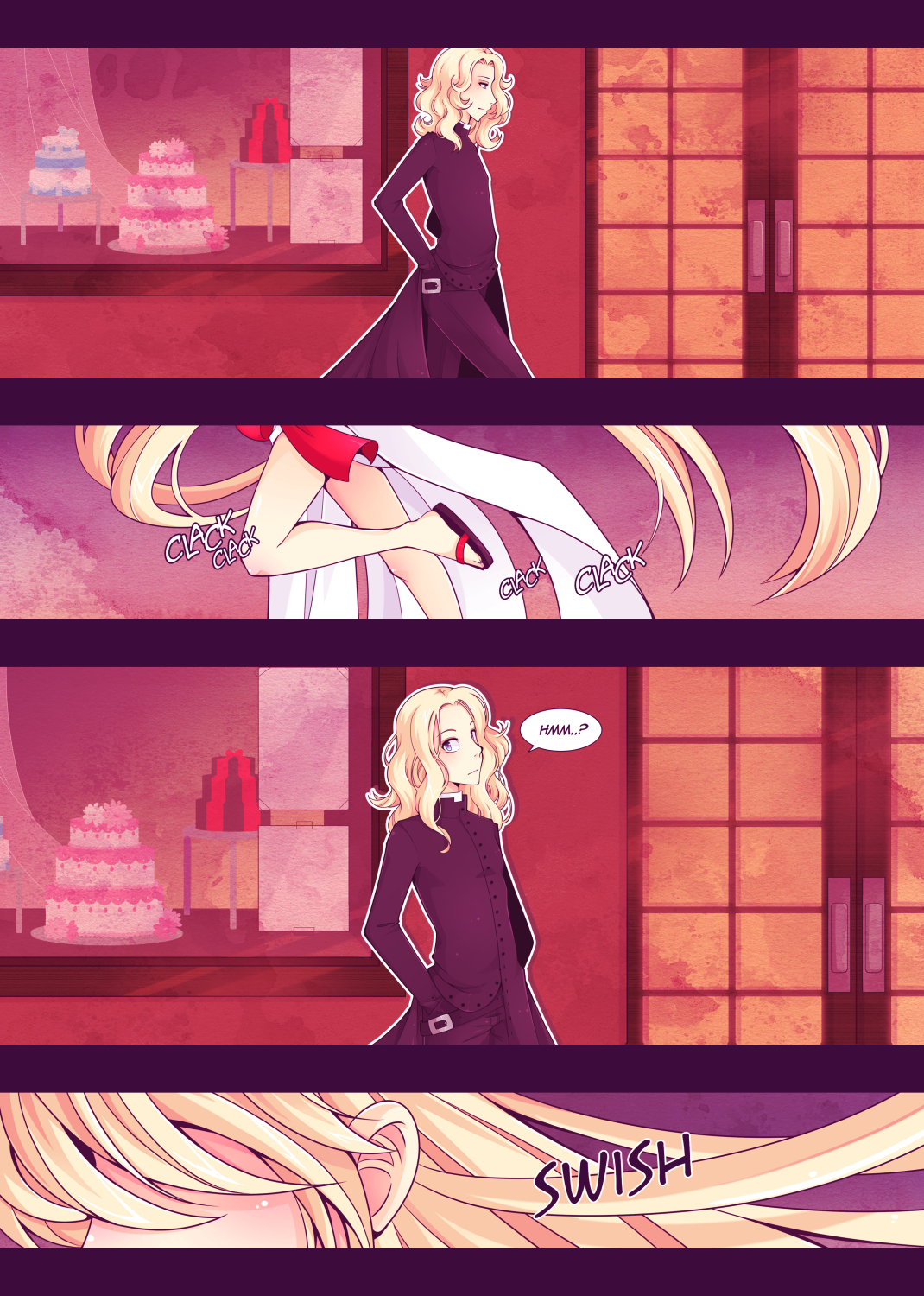
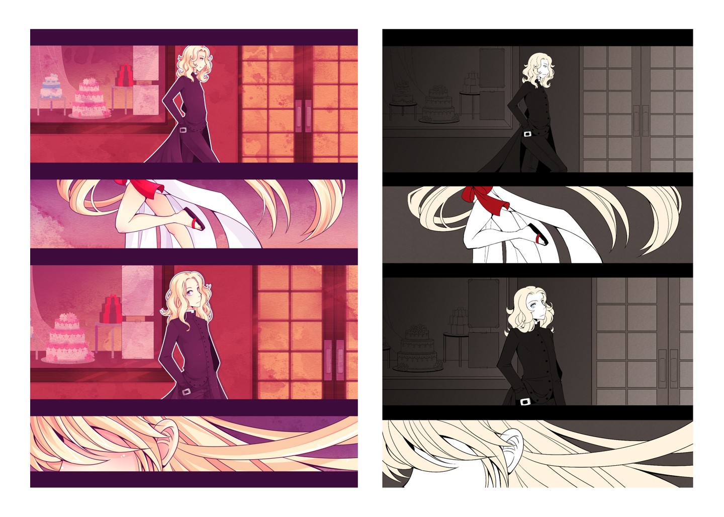
When I originally thought up Paradise, I wanted it to be black and white, manga style. But certain design elements were difficult to get across with just black, white and greyscale… So I added a limited color at first. For Chapter 2, I started to go full color, I’m not really sure why, probably to stand out more… Then I decided I should redo the older pages to match, and since I was doing it anyway I might as well fix some of the more egregiously bad art…
I like the colored version, it really adds something, but at the same time it takes so much more time… Maybe I shouldn’t have… I’m not even sure I’ll ever finish the story in my lifetime lol. But I’m stubborn and I really like the way it looks, so I’m sticking with it. Anyway I’ll put comparison pics of the old art below.
Welcome to Paradise


